Charts are visual representations of any report or list in view in Wurk. Depending on your role, you may see preconfigured dashboards on the Home page and from sub-menus on the main menu (called Dashboard) that are already hooked to charts. If you do not see any dashboards, don’t worry, these are generally intended for Managers and Administrators and you can probably skip this topic.
Prerequisites: Once you have created a chart you think is helpful and you want to see it at a glance, you can hook it to a dashboard in Wurk for easy navigation, following the steps below.
Wurk provides the main dashboard with tabs along the top for each module you have permissions for (managers will see more tabs than a regular employee). A dashboard contains widgets with summary information and links to drill down to more details. You navigate to the main Wurk dashboards from the main menu (wherever you see Dashboard as a sub-link) and from the Home page (just click Home at the bottom of the main menu). The Team Time Dashboard, for example, summarizes time entries and trends for people who report to you if you are a manager. If your dashboard does not look like the example shown here, either your Administrator has customized it or it still needs to be configured. If your company has built you a custom dashboard, you can navigate to it at bottom of the Main Menu (click Dashboard). You can also configure your own dashboards by building your own reports and then saving them as charts. Your Administrator or manager can also do this for you and then share the dashboard with you. If you need help with this, you or your Administrator should contact your Wurk Account Manager.
START HERE
1. Navigate to a dashboard you want to hook a saved chart to, either from the home page (as shown below) or from any Dashboard sub-menu option in the Team tab of the main menu.
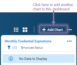
2. The example below shows the Team dashboard (from Team>My Team>Dashboard). Click Add Chart to start adding a chart.
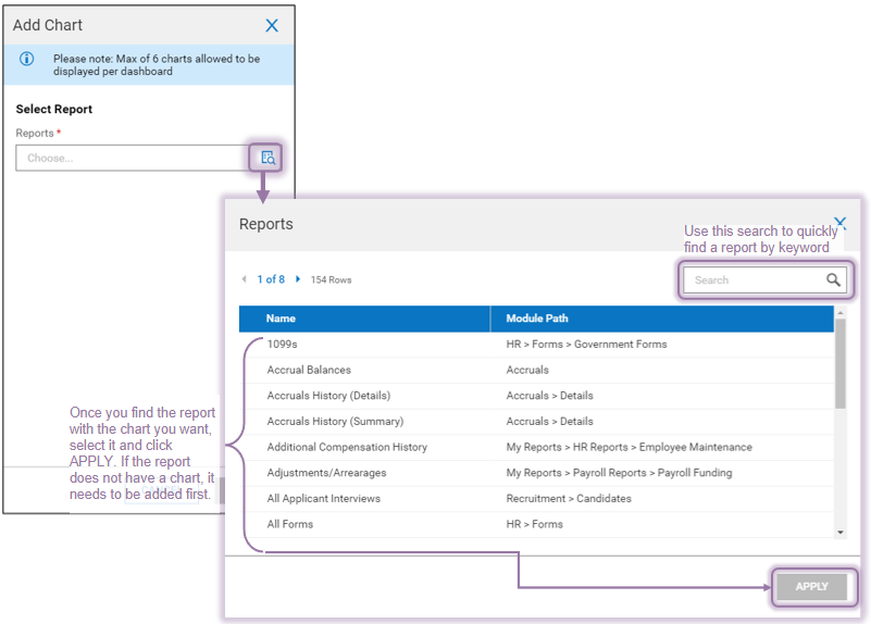
3. In the Add Chart popup, click on the search icon to navigate to a report that has a chart you want to show on a dashboard, (these are the same reports you see under My Info>My Reports).
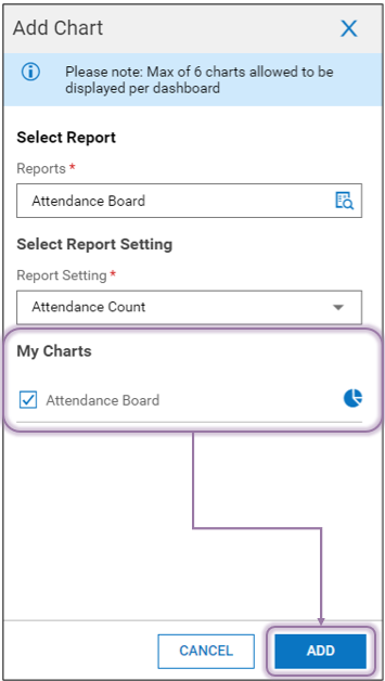
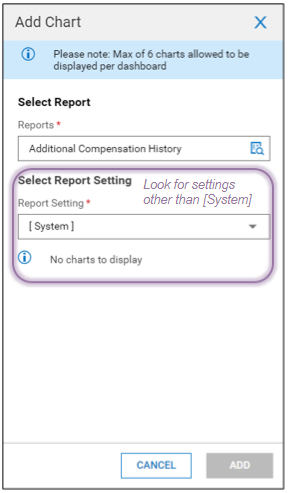
4. Once you select a chart, you will be prompted to Select a Report Setting. [System] is the default setting for the report (generally, reports with saved reports will have other names). Once you find your Chart, select it and ADD.
If no charts have been created for the report under that Report Setting you select, you will see No charts to display.
5. The new chart now shows on the dashboard you chose in Step 1.
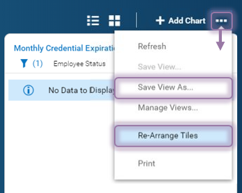
You control the layout of your dashboard or save it with your own special name from the Actions 

