When working with reports (list views) in Wurk, you can create visually meaningful charts to see the data at a glance. You can then add these charts to your Wurk dashboards for easy access.
From any report you have customized and saved, follow the steps below to hook it to the chart that shows on the dashboard you came from.
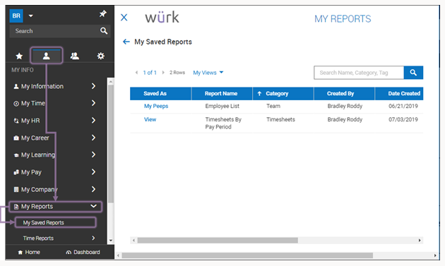
The standard dashboards that come loaded with Wurk show charts to summarize the most common information you will need for your role. These are configured during implementation and come from reports. You can use these as shortcuts to create your own custom reports and display them instead on your own dashboards. You can have up to six charts on each dashboard. If you do not have these dashboards, you can still customize and save reports (especially those shared with you by other Wurk users). Once you have saved a report, simply navigate to My Info > My Reports > My Saved Reports), open and run the report, and then follow the steps below to add charts.
START HERE
1. Navigate to a saved report you want to make into a chart. This can be from a dashboard on the home page or from My Info > My Reports.
2. If you are using a report you saved under My Saved Reports, run the report.
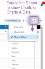
3. At the top of the report, use the Mode option to toggle the view to show a list with charts and data or just charts.
You can create a chart from any responsive report in Wurk, and you can see both the chart and the report at once.
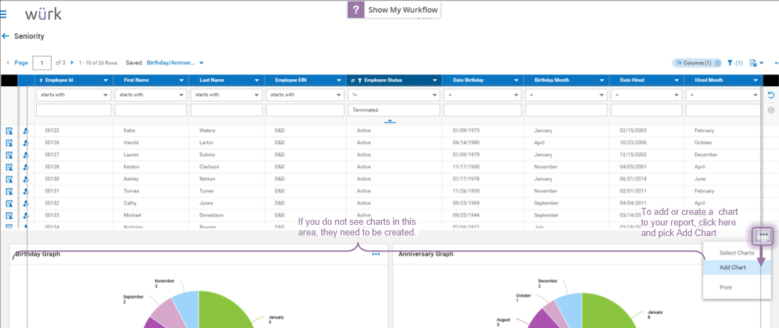
Not all reports have a responsive design, and not all reports can be turned into charts. If you want to create a custom dashboard, first view the report as shown above and then see if you can Add Chart as shown below.
4. In the Charts area that then displays, click the Actions 
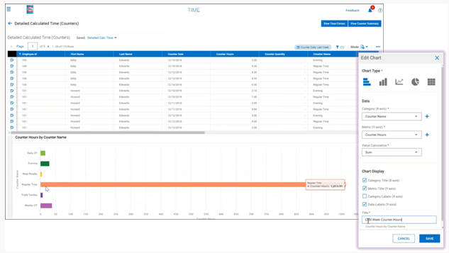
5. In the Edit Chart popup, set fields to create your chart
Example: For the Detailed Calculated Time report shown below, the settings shown create a bar chart that breaks down employee’s hours by counter (type of hours).
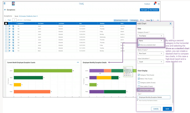
When you are creating bar charts, you may see the Stacked Chart option, which allows you to visually compare multiple items on the horizontal (x) axis. The example below is a stacked chart showing an employee’s daily overtime hours for several weeks so the amount of overtime per week can be compared (you can work with this chart in the report under Team > Reports > Calculated Time from the main menu).
Note: When viewing a chart, you can mouse-over each element to see where it came from in the report, or you can select the Data Labels checkbox to show them on the chart. This helps you quickly interpret the chart.

